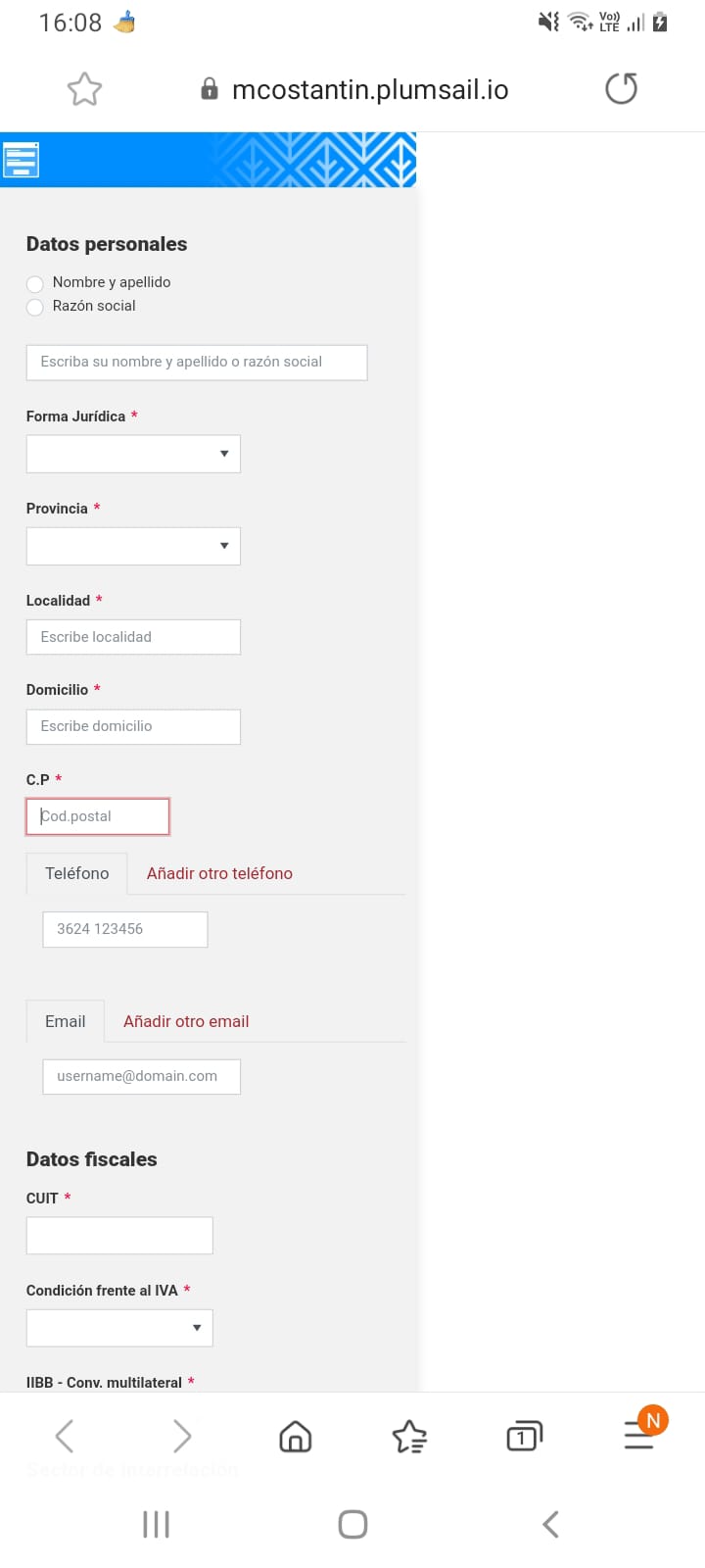
I have a problem with the display of the form on mobile devices.
On computers it looks perfectly and is responsive but on cell phones the following happens:
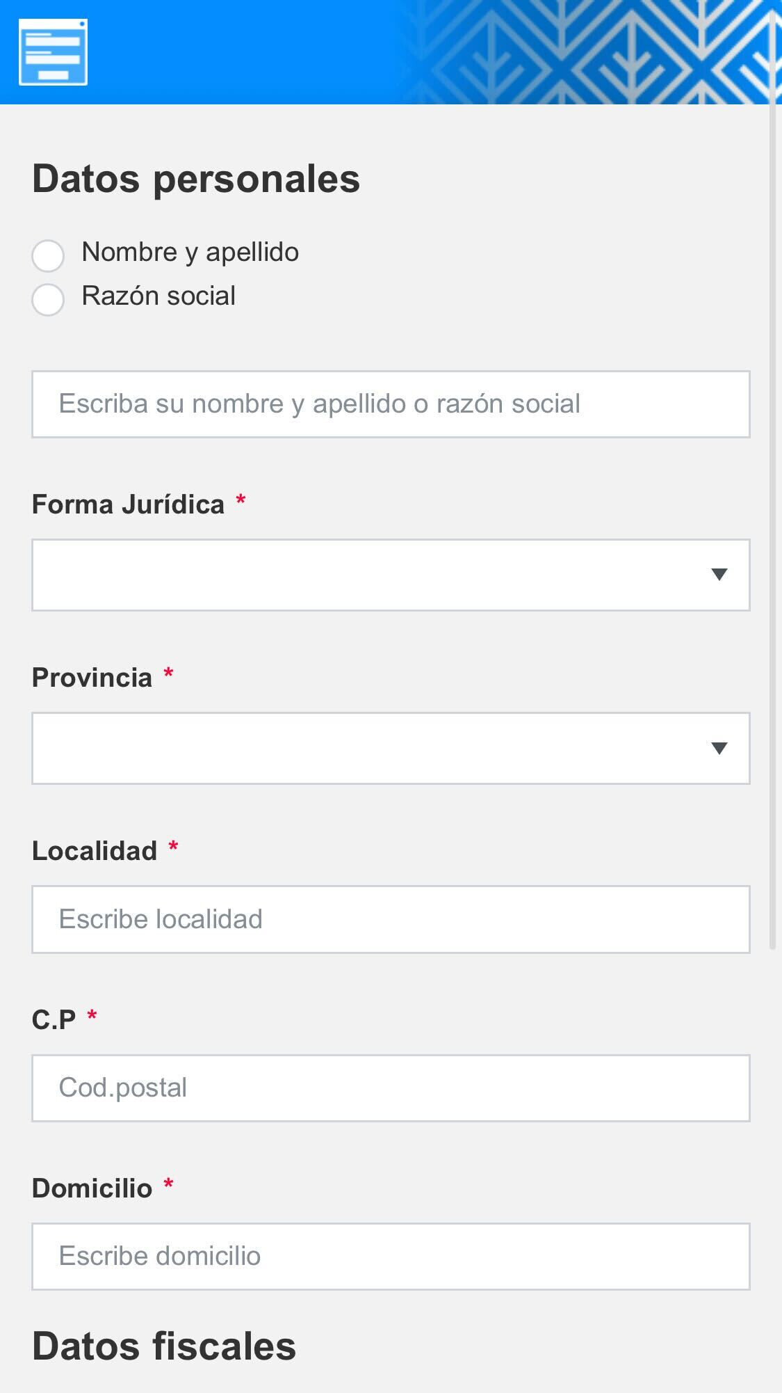
(I want it to be viewed in full screen)
I do not know, if I should add some code in CSS so that this does not happen since the responsive thing does not work even if it does it with grid-type fields.
Thank you very much, I hope any help
Hello @belen_costantin,
What OS is on your phone? What browser are you using?
Please share the form link, I will test it on my side.
The operating system is android, I tested on several cell phones with the same operating system, only one (chrome browser) looks good. In the Samsung Browser that comes by default, I know that it does not work well.
https://mcostantin.plumsail.io/b3dee5b1-337c-42d5-a331-1dce57c8f483
Thank you, I am looking forward to your response
@belen_costantin,
Thank you for the link! I see the same issue when viewing the form.
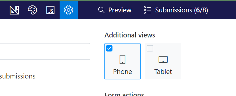
Do you have any custom CSS on the form? Have you created an additional view for the Phone?
If I have created a form design especially for cell phones and another for pc or tablets but I only manage with the interface of the plumsail designer, using grid containers (I did not place CSS in the mobile form because I do not know what configuration I should add)
@belen_costantin,
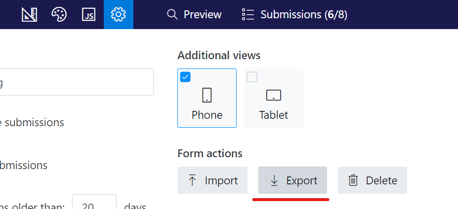
Please export the form for the phone and share it. I suppose that the issue might be in grid settings.
Then I attach the json! Thanks
Formulario Cliente CC (0) (1).json (30.1 KB)
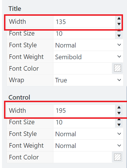
Hello @belen_costantin,
There is no need to define the width of the fields' title, control, and grid containers:
This way you fix the width of the content, and the form is no longer responsive. Leave the width properties blank and the content will fit the mobile device screen: