How can I create a pie chart to show the distribution of different types of budgets (total of commit, actual, balance) in percentage from a sharepoint list below
Thanks
Dear @Ferry_Aritonang,
We'll need a bit more info on this one - what are the requirements for the pie charts, how should they look, what data do you want to showcase and how to sort it?
Anything else you need to compare it with, other than what is seen on the screenshot? If there is it static data or another list?
Dear @Nikita_Kurguzov ,
I just need to show a pie chart that shows the budget distribution (Commit, Actual, Balance) from that list, so it will show the total amount of Commit, Actual, and Balance. And in percentage if possible.
Thank you.
Dear @Ferry_Aritonang,
Had to do a few tricks for this. Below is probably the easiest way to do it, but there maybe more elegant solutions, this seems to work though.
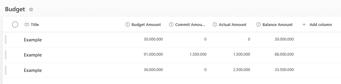
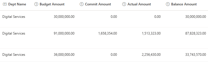
Created a similar list:
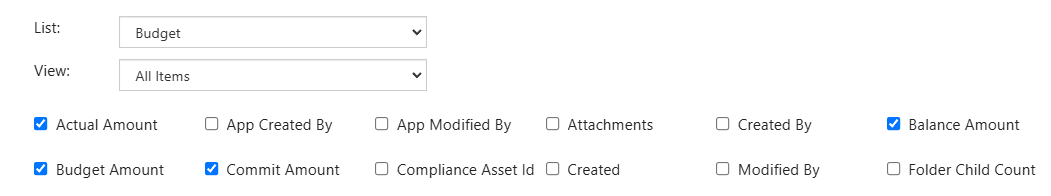
Selected the fields that we need, all four columns
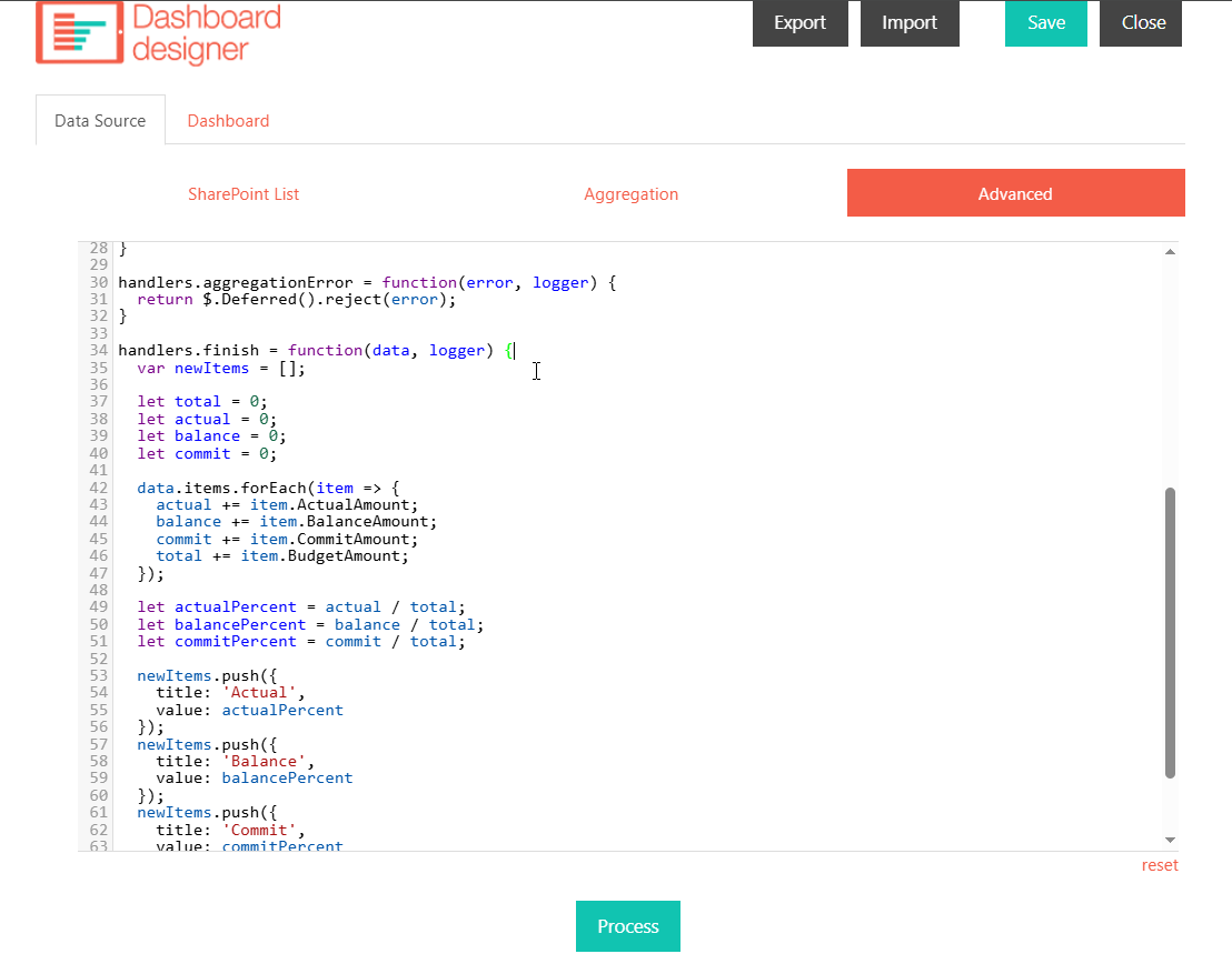
Used the following code in Data Source > Advanced:
handlers.finish = function(data, logger) {
  var newItems = [];

  let total = 0;
  let actual = 0;
  let balance = 0;
  let commit = 0;

  data.items.forEach(item => {
		actual += item.ActualAmount;
    balance += item.BalanceAmount;
    commit += item.CommitAmount;
    total += item.BudgetAmount;
  });

  let actualPercent = actual / total;
  let balancePercent = balance / total;
  let commitPercent = commit / total;

  newItems.push({
    title: 'Actual',
    value: actualPercent
  });
  newItems.push({
    title: 'Balance',
    value: balancePercent
  });
  newItems.push({
    title: 'Commit',
    value: commitPercent
  });
  data.items = newItems;
  logger.debug('Data is processed: ', data);
  console.log('Data is processed: ', data);
  return true;
}
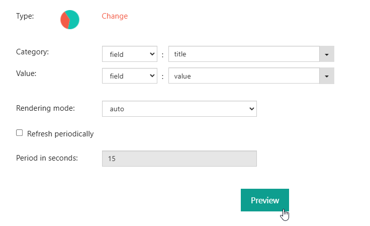
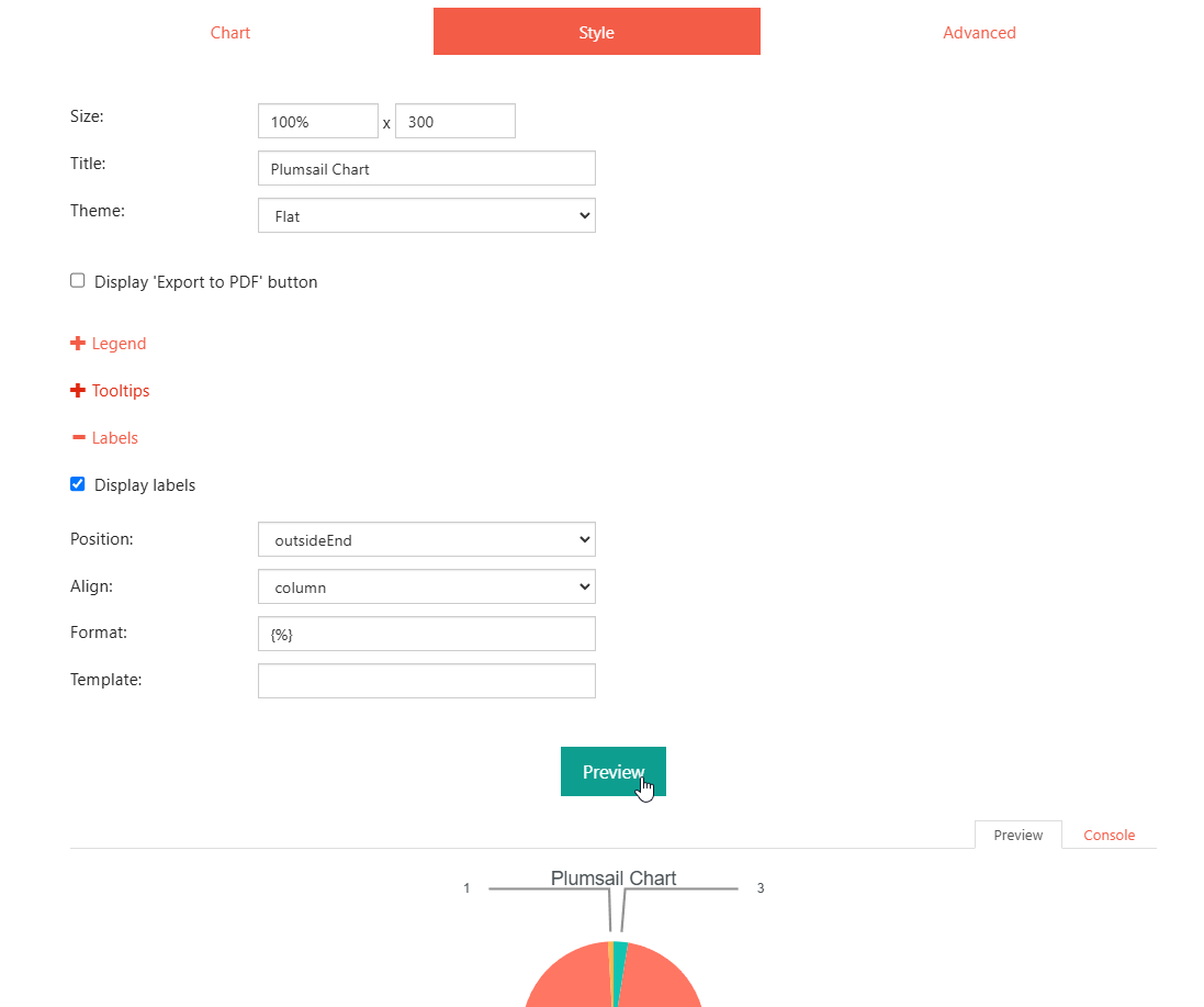
And with the following config, got the Chart:
Just slightly changed the Label formats in Style:
Dear @Nikita_Kurguzov ,
It works!
Thank you so much for your support.