Hello, @Margo
I think I too was “lazy loading” that post, wasn’t I?  I was so tired and just wanted to put a question out in the universe but didn’t really offer anything valuable. Thank you so much for asking.
Let see…
Table titles are renamed to provide the user a more readable experience.
fd.spRendered(function () {
  fd.control('MediaUpload').ready().then(function (dt) {
    const grid = dt.widget;
    if (!grid || !Array.isArray(grid.columns)) return;

    const titles = {
      //Table:            'Is this a Table?',
      MediaUploadType:  'Choose Stem or Options',
      MediaFileType:    'Media File Type',
      BodySite:         'Body Site',
      MediaDescription: 'Media Description'
    };

    // Create a new columns array with updated titles where keys match
    const newCols = grid.columns.map(col => {
      const key = col.field || col.dataField || col.title;
      if (key && titles[key]) {
        return Object.assign({}, col, { title: titles[key] });
      }
      return col;
    });

    grid.setOptions({ columns: newCols }); // Kendo will redraw headers
  });
});
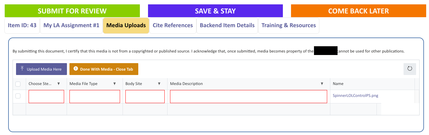
The four required fields are of the following types (from left ot right): Choice, Choice, Choice, Multiline plaintext and have a validator checking for their values on save - the fields are not required at the SharePoint column level, instead the validator sets the requirement.
fd.validators.push({
  name: 'MediaValidator',
  error: 'MISSING REQUIRED FIELDS: Go to the Media Uploads tab to address.',
  validate: function () {
    return pnp.sp.web.lists.getByTitle('Media')
      .items
      .filter(`parentListItem eq ${fd.itemId}`)
      .select('Id,MediaUploadType,MediaFileType,BodySite,MediaDescription')
      .get()
      .then(items => {
        if (!items || items.length === 0) return true; // nothing to validate if nothing uploaded
        return items.every(it =>
          it.MediaUploadType && it.MediaFileType && it.BodySite && it.MediaDescription

        );
      });
  }
});
The three buttons at the top of the form travel with the user as they scroll up/down the screen, then stow away after 2 seconds of mouse/keyboard inactivity to give the user more viewable area to review their work. I mention this because you may want to know about other things happening in the form that may impact the loading of other features.
When first uploading a file, the user sees red outlines around the four required fields to draw their eye to the areas that need attention.
The red outline is set in the DL itself using JSON to format the columns - this is the [MediaUploadType] column formatting.
{
  "$schema": "https://developer.microsoft.com/json-schemas/sp/v2/column-formatting.schema.json",
  "elmType": "div",
  "style": {
    "box-sizing": "border-box",
    "padding": "0 2px",
    "overflow": "hidden",
    "text-overflow": "ellipsis",
    "border": "red",
    "border-style": "solid",
    "border-width": ".5px"
  },
  "attributes": {
    "class": "sp-css-backgroundColor-white sp-field-fontSizeMedium sp-css-color-black"
  },
  "children": [
    {
      "elmType": "span",
      "style": {
        "overflow": "hidden",
        "text-overflow": "ellipsis",
        "padding": "0 3px"
      },
      "txtContent": "[$MediaUploadType]",
      "attributes": {
        "class": "sp-field-fontSizeMedium sp-css-color-black"
      }
    }
  ]
}
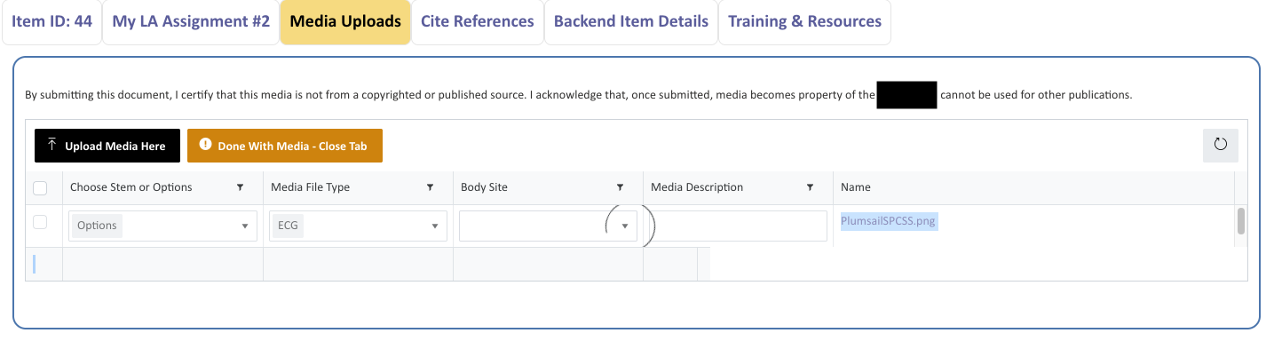
In this next view, I have completed a few required fields and am working my way through another.
After a file uploads, the first required field the user attempts (any one of the three Choice fields or the Multiline text field), the user is presented with a spinner and must (on average) click three times before they can select the first value value or enter text in the multiline field. Once the table “wakes up” and the first required field allows a selection or input, the remaining fields usually behave as desired - but not always as is illustrated below.
This happens on every form, with each upload event, multiple browsers (Chrome, Edge, Opera, Firefox), and is definitely not ideal - yet it eventually works. So it not nonfunctional but it would be nice to have the table “warm up” before the user starts interacting with it.
The second issue about row depth may truly be a vague thought I had that if I increased the depth, the required fields would be easier to click. But in truth, the problem isn’t that the fields are “hard to click” - it’s more that they are sleeping  . So while knowing the CSS for the row depth is a “nice to know”, it’s not critical.
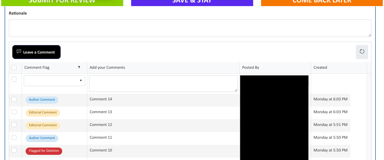
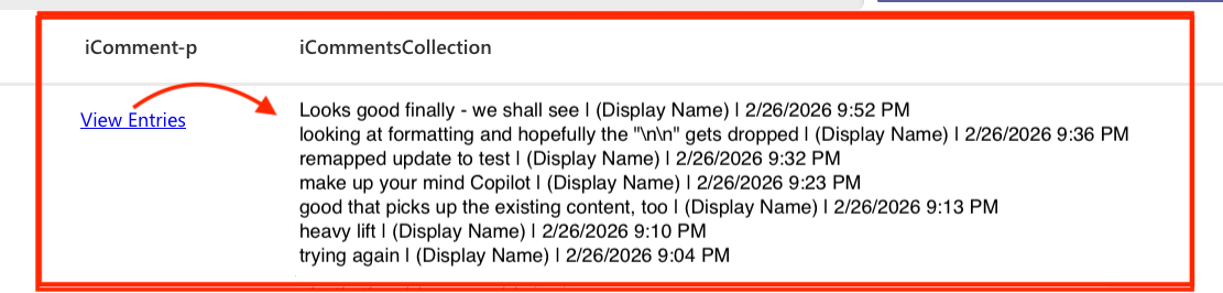
The other Plumsail List or Library control targets a List and is where users post comments and have discussions with others who may review the form contents.
The required field has a validator like the Media Upload example above, but no JSON is applied in the backend list - so no red outline border.
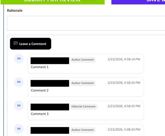
Here is where my modern styling comment “more modern, stylized look and feel - it feels old and looks legacy” come into play.
I was testing a drop-in HTML option and liked how it looked but it was a nightmare to configure so I abandoned it but this was the early look & feel that I really liked. It’s a Microsoft-like layout and the stakeholders would ideally like to be able to “like” and “reply to” comments much like Teams, etc. If CSS and JS could morph a List or Library control into something like that, that would be fantastic but I haven’t found any in the community posts yet but I have missed some!