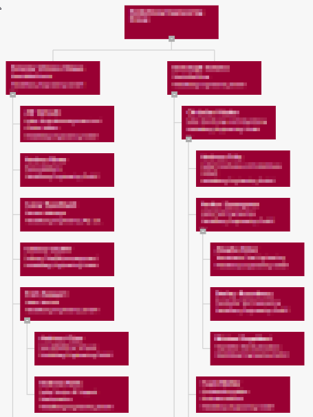
We are using both org charts that are based on ADFS data and those that pull data from SharePoint lists. Generally, both approaches work for us. However, there is a difference in the layout/orientation depending on the data source.
Looks like you have different hierarchies in User Profiles and in the list. That is may be why the charts look different even though there is used the same default layout.
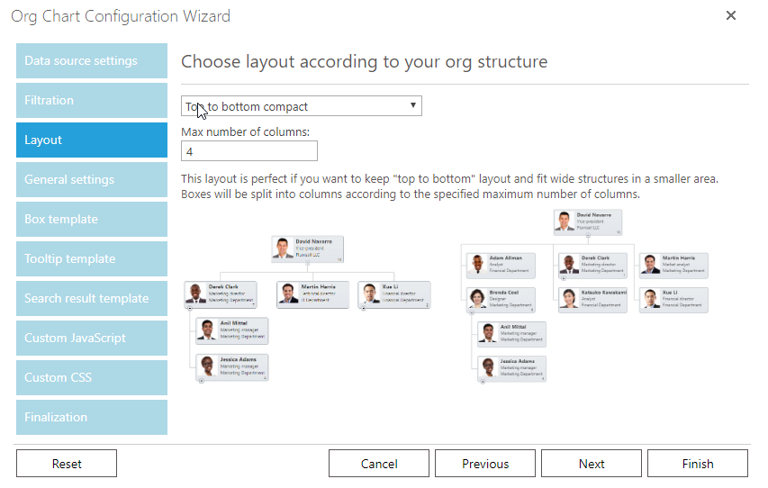
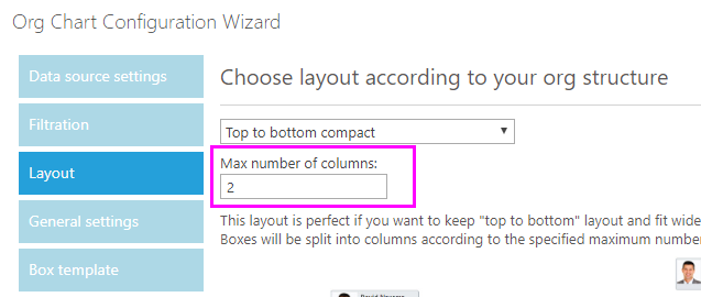
You may try different layouts by choosing them on the Layout tab of the configuration tab:
The SharePoint lists have the same hierarchy. We also tried all available layouts again today and "Top to bottom compact" is exactly the look we would like to achieve.
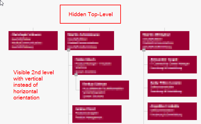
However, the compact view does not "fan out horizontally" at the second level like in the screenshot above. We think this may be due to the fact that we are hiding the top-level via CSS. So, in our org chart the actual second level is at the top.
Is there some way to make the compact view work with a hidden top level?
Thank you. For "Top to bottom compact" we already tried higher numbers of columns without success. Basically, the number of columns does not change the display at all.
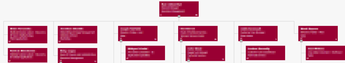
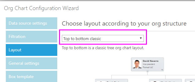
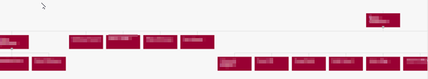
Top to bottom classic actually results in a horizontal orientation of the org chart. However, due to our org structure this leads to a very wide chart (several screens side by side):
I realize that there may not be a solution for our particular scenario...