Hello,
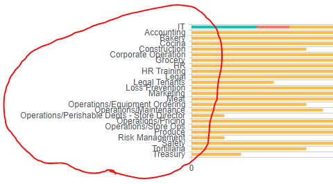
I am trying to adjust the labels on the y axis so they can be more readable. It current looks like this.
I went to the dashboard advanced tab with this code:
config.valueAxis.labels.margin = "10px";
It doesn't appear to be working. I am not sure what I am doing incorrectly. Here is my whole code:
var handlers = {};

handlers.preRender = function (config, logger,el) {

    logger.debug('Configuration: ', config);


    var filtrationApplied = false;


    config.plotAreaClick = function (e) {

        if (!filtrationApplied) {

            window.location.hash = '';

        }


        filtrationApplied = false;

    }


    config.seriesClick = function (e) {

        if (ctx && ctx.clvp) {

            var filter =

              'FilterField1=AssignedTo-FilterValue1=' + e.dataItem.__proto__.AssignedTo

              + '-' + 'FilterField2=Status-FilterValue2=' + e.dataItem.__proto__.Status;


            window.location.hash = 'InplviewHash' +

            ctx.clvp.wpid + '=' + encodeURIComponent(filter);


            filtrationApplied = true;


        }
      config.valueAxis.labels.margin = "100px";


    }


    return true;

}