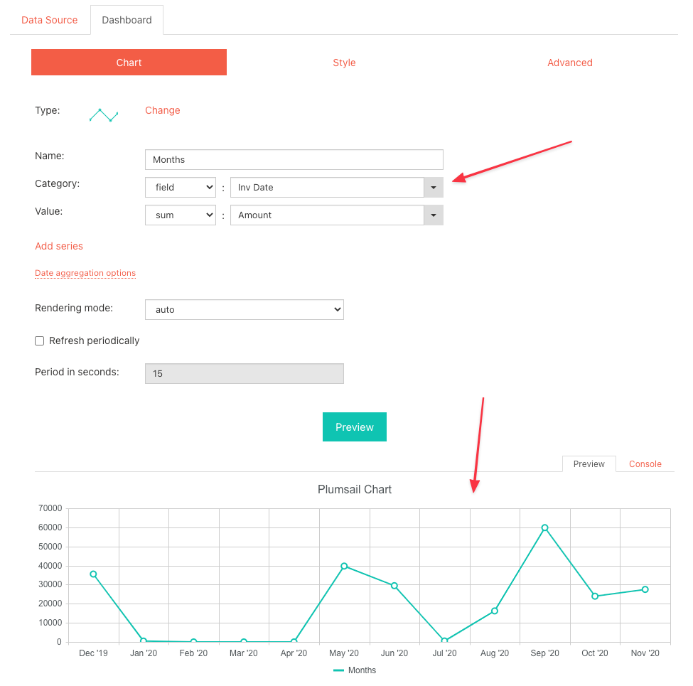
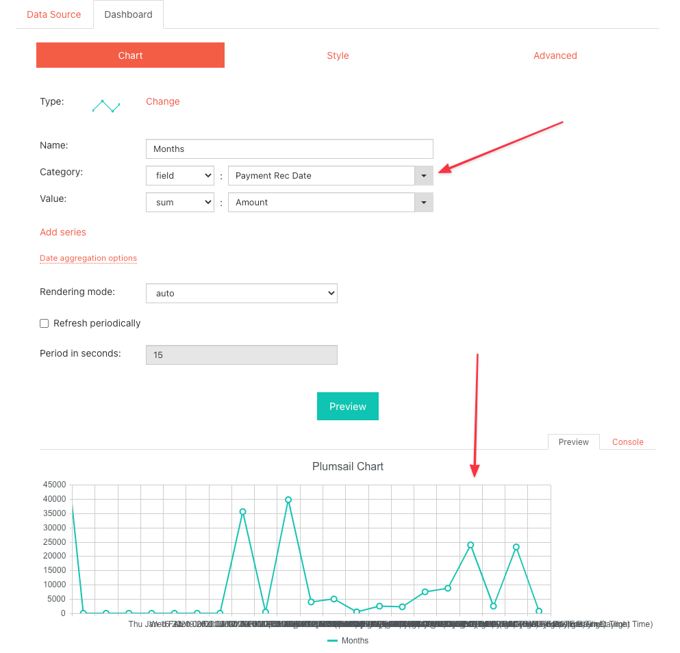
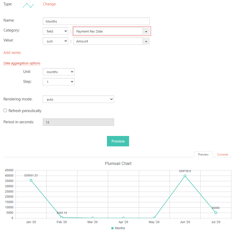
I'm having an odd problem with Dashboard Designer. I created a very simple line chart to display a sum of invoices by month. It works great as you can see below. The department wanted, instead, to see the same chart, but instead of using the "invoice date" they wanted to see it by "payment received date". Both are date only fields in a small sharepoint list with only 25 items. The ONLY thing I changed was the field as you can see by the screenshot, but when I change it from one date field to another, the results are very different and it doesn't seem to aggregate by month.
I'm sure I'm doing something wrong, but has anyone else run across this, or could help me? I've tried created a completely new chart and get the same results. I would think I could switch that field back and forth and it should be easy.
It should be easy as you've mentioned. Are you sure both fields are formatted the same way? are those calculated columns?
How about aggregation? Are you grouping?
The two Date columns, Inv Date and Payment Rec, are there blanks? or is there date for each of the 25 items.
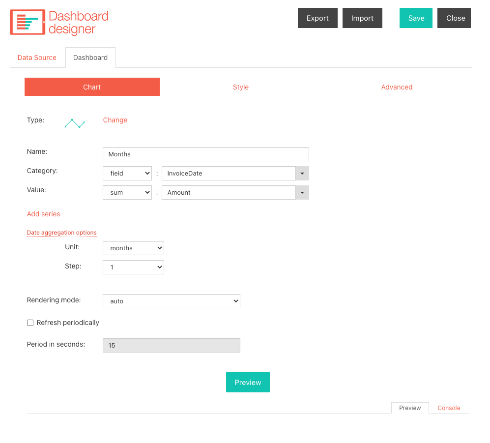
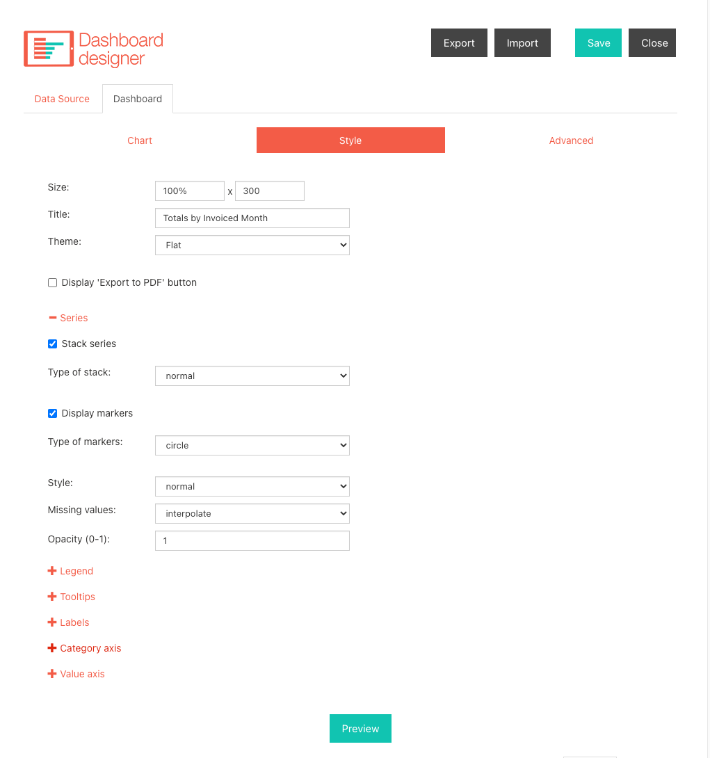
Both fields are formatted exactly the same. They are not calculated fields, and set as Short Date with Standard format. There is no grouping set for the chart. (see below).
The invoice date has an entry for every single record, however, the payment received date does not, as some payments haven't been received yet.
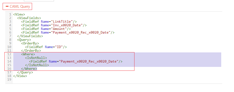
I literally just click the down arrow on the series field option and change from Invoice Date to Payment Received Date. I've also included a screenshot of the sharepoint list data.