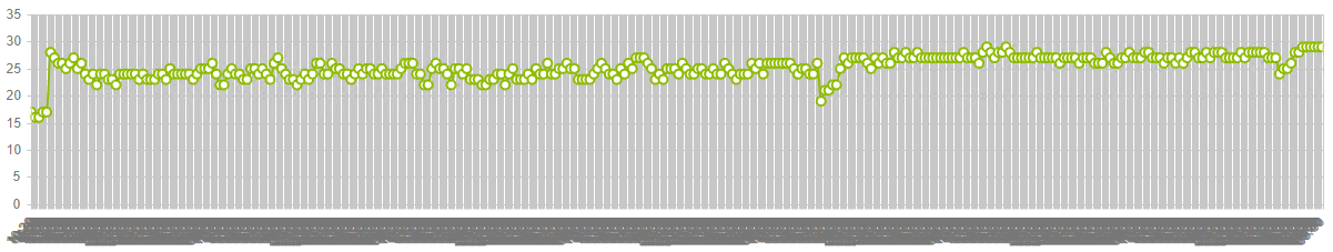
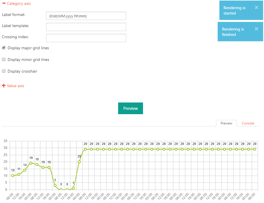
I came across with another "issue". My source list is kind of a procution forecast which got entries for every 30min. Summed up the source list got about 350 entries which is far to much to display in a single line chart. It leads to this:
My thought was to use the aggregation. Unfortunately the step count with 10 is far too short and auto is not applicable in this case.
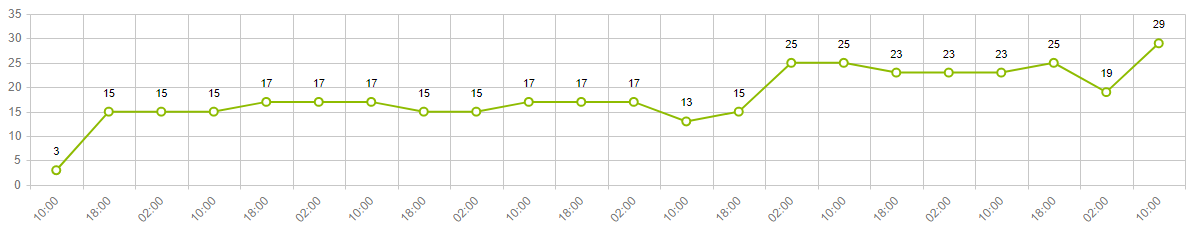
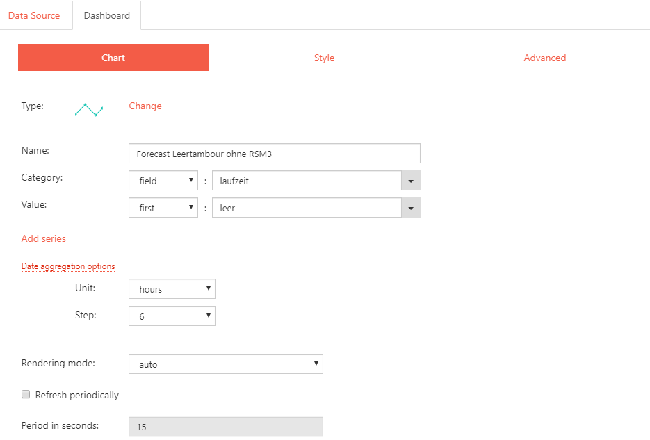
Going to an hourly aggregation with step range 8 gives me this:
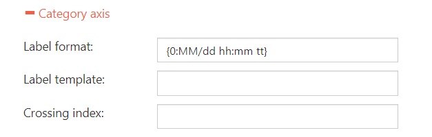
Which looks already good but it's missing important information. Only the hours are shown and not the whole value of type datetime. So far I didn't find a working Label format to overwrite this behaviour.
My last possible solution would be to use only every n-th vlaue to show in the diagramm. Any suggestions or ideas where to look for this?
@Margo,
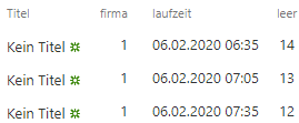
It is a datetime column. The output in SharePoint list view is simply the German locale. The original data source is much worse. It comes from an IBM Informix in the format "datetime year to fraction(3)" which is automatically transformed to a datetime in SharePoint.
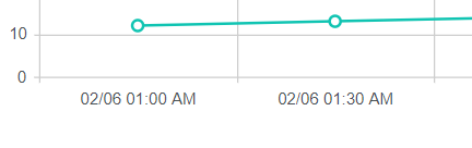
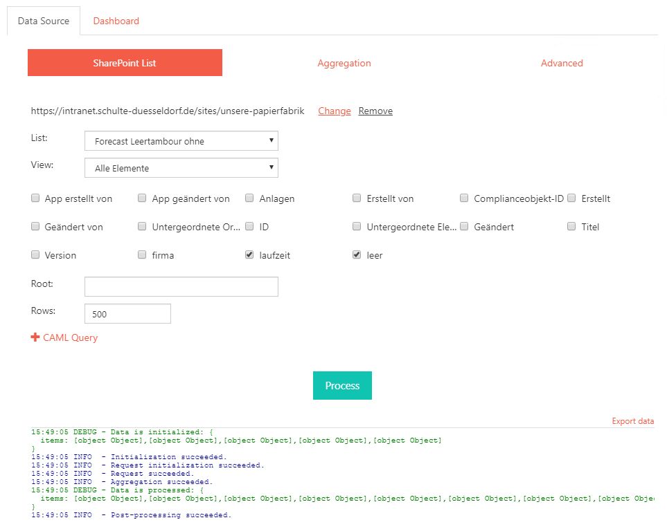
Could you please process and export the data as shown on the screenshot, and share the result file. I will build the dashboard with your data on my side and check the issue with the labels.