Hi,
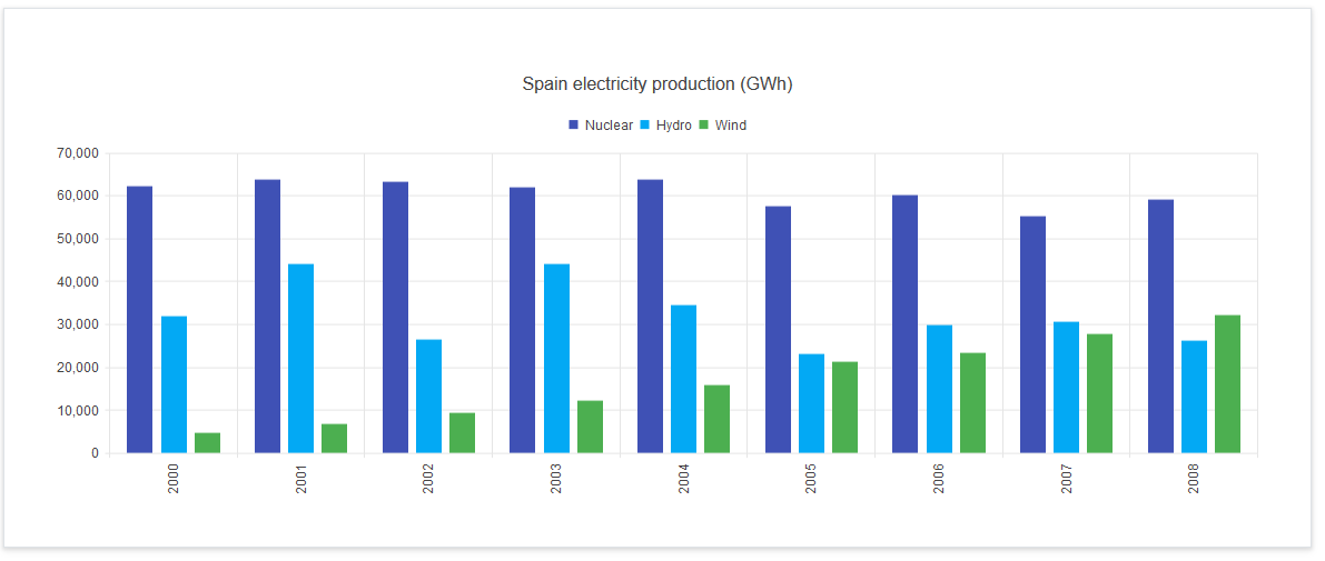
Is there a way to configure the bar chart showed in demos.telerik.com/kendo-ui/chart-api/events, where there are 3 bars per Year on the x axis?
Hi,
Is there a way to configure the bar chart showed in demos.telerik.com/kendo-ui/chart-api/events, where there are 3 bars per Year on the x axis?
Hello,
First of all, you will of course need to select all appropriate fields in the data source. Then go to Dashboard -> Advanced and add the following code inside the preRender function:
[code] //this is example for one series
var series2 = $.extend({}, config.series[0]);
//replace “ValueFieldInternalName” with the internal name of the field that will be used as the value field
series2.field = “ValueFieldInternalName”;
config.series[1] = series2;
//this is an example for the next series
var series3 = $.extend({}, config.series[0]);
series3.field = “ValueFieldInternalName”;
config.series[2] = series3;[/code]
Hi,
Is it possible to add the series by list name?
For example, I have 3 lists with different names, with same field names: Area, Count, Year.
Can I show the 3 columns as Listname1, Listname2, Listname3 with Year on X axis and Count on the Y Axis?
Thanks.
Sure, you can aggregate data from multiple lists programmatically. Here is a sample:
https://plumsail.com/blog/2015/08/using-multiple-lists-in-dashboard-designer/