Im trying to replicate a stacked column chart Ive built in Excel using the Dashboard designer. Im accessing the same data as the Excel chart as shown below:
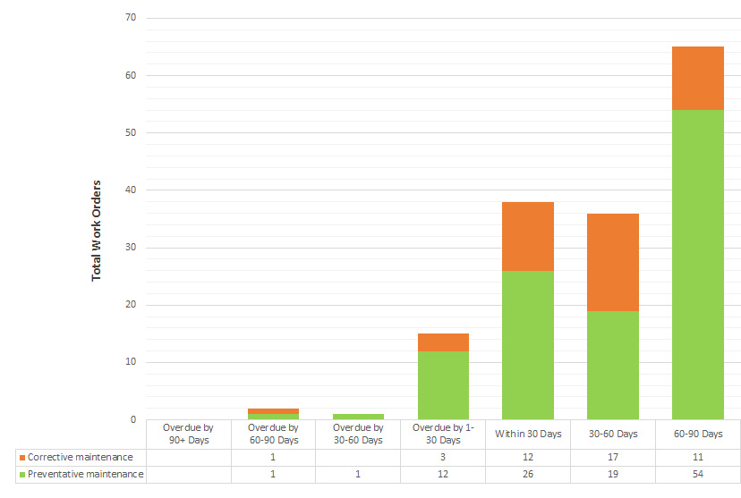
The data i'm working with is a custom snapshot tool, that captures a weekly total of items within defined date ranges. An example below:
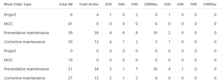
There are multiple rows sharing the same 'Work Order Type' that need to be grouped as a total for each timeframe value, e.g. D30 (Due in 30 Days), D60 (Due in 30-60 Days) etc.
I can easily display the totals of each timeframe using aggregation sums on each column, but I cant seem to work out how I can also show the split by what 'type' they are, in the way Excel can. Any help would be much appreciated.