
Hi,
In the Wizard Control, I would like to hide the 'Next' button until all required fields are completed. Is there a way to do this? Thanks!

Hello @ParAvion,
It is quite complicated to hide the Next button until all required fields are completed.
Do you know that the Wizard container has a build-in validation of each step?
If all fields in the step are required, a user will not be able to move to the next step and will receive the error message if any field is blank.
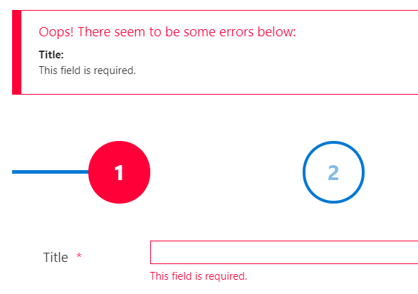
@Margo thanks. Can I modify the error message?
You can change the Wizard validation error message using this code:
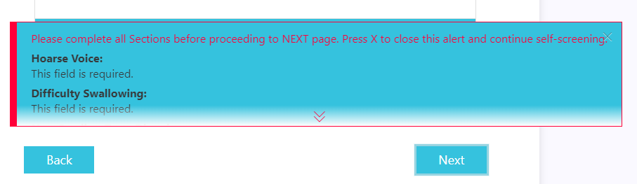
fd.messages.PlumsailForm_CorrectErrors = 'Your text';Is it possible to move down the wizard error section validation from the top to the bottom right on top of the next button?
The way it is at the top causes users to not see it if the form is long.
Thanks,
Alberto
I was able to move it down with the CSS below, but is there a way that we can make it so that if you tap anywhere in the error box it would close and not only if you click on the X? Sometimes it is hard to click on the X and you have to tap multiple times. Also in my case, this is for a Public form.
.fd-form .alert-danger {
position: fixed;
top: 300px;
z-index: 1;
}
Dear @adasilva,
Thank you for the feedback! It does make sense to move error message to the bottom when working with the Wizard - I would add this to our ideas section, this might be implemented in future versions out of the box.
As for the closing the window, you can try the following code to drastically increase the size of the X button, making it cover the whole window (but not outside):
.fd-form .alert-dismissible .close {
  width:10000px;
  height:10000px;
}
1 Like
Thank you Nikita, is there a JavaScript that would make the error message expanded by default? Some users are not clicking the arrow to expand it.
Dear @adasilva,
Try adding the following CSS:
.fd-form .alert.alert-danger.alert-dismissible.alert-errors{
  max-height:100% !important;
}

.fd-form .alert .alert-expander, .fd-form .alert .fadeout{
  display: none;
}
1 Like